global look?

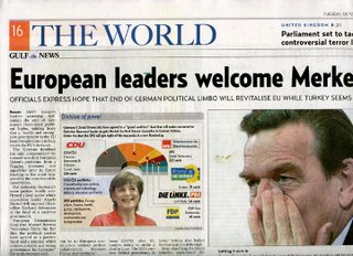
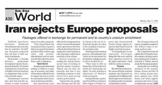
When I left the country a few months ago, I found out newspapers in other parts of the globe look very much like Sun.Star. Take Gulf News in Dubai, United Arab Emirates for instance. It has more or less the same look for section heads with SunStar. Same with its latest competitor, Emirates Today.
I was blabbering to my friends Franzty and Ador the first time I saw it. Another friend who also saw the newspaper made the same observation and commented, “Mura man ni og Sun.Star oi.”
 As a backgrounder, Gulf News is designed by no less than Mario Garcia, so called icon of newspaper design. He did the redesigns for the Wall Street Journal. (I was in the old domestic airport in Manila waiting for my Cebu Pacific flight years ago when I saw it and was really amazed how he was able to preserve the paper’s traditional look while at the same time giving it a 90s touch.)
I liked Garcia’s pre-compact newspaper designs. He now advocates compact newspaper as the wave of the future - something that a local newspaper followed. It recently had a redesign that also saw the newspaper resized.
Garcia made his point clear with the redesign of the San Francisco Examiner. I downloaded the pdf file of his redesign rationale years ago, impressed with his bold experiment.
I’m amazed at the influence he has on entire news organizations that he can tell everyone from the owners to the editor that not only the paper is going to change its look but also its treatment of stories. From a broadsheet, he transformed the Examiner to a compact size.
In a few years (although circulation surged for a while at the start) the Examiner lost money and was eventually sold. Last time I checked it is still struggling under new owners.
The similarity with the Garcia-designed newspaper is not really unexpected. Sun.Star is not designed as a broadsheet but as a tabloid-sized newspaper, while Garcia’s Gulf News design is influenced by his advocacy of compact sizes. Unlike his other works in broadsheet, his design for Gulf News is far from traditional.
Another Dubai newspaper looks similar to SunStar and more rightly so since it is of similar size. Emirates Today is guided by the same principle that govern Sun.Star’s design. Intrinsically, the two are anchored on the same philosophical basis – that size determines a paper’s form.
Almost everyone I’ve talked to regarding the newspaper’s design bring with them broadsheet layout ideas that just don’t ring true with the tabloid-sized SunStar. One has to stop looking at Sun.Star with broadsheet colored eyes – something that another local daily in Cebu, recently acquired by a national newspaper, learned the hard way. It had to make the mistake of making the local paper a clone of its national partner before realizing it just can’t work.
I’m not actually comfortable explaining myself here or critiquing other local dailies. Last time I did that, explaining Sun.Star’s design as being tabloid in size but never tabloidish in content, a competitor changed its editorial style. Maybe I’m assuming but hey, they had such ubiquitous timing.


0 Comments:
Post a Comment
<< Home