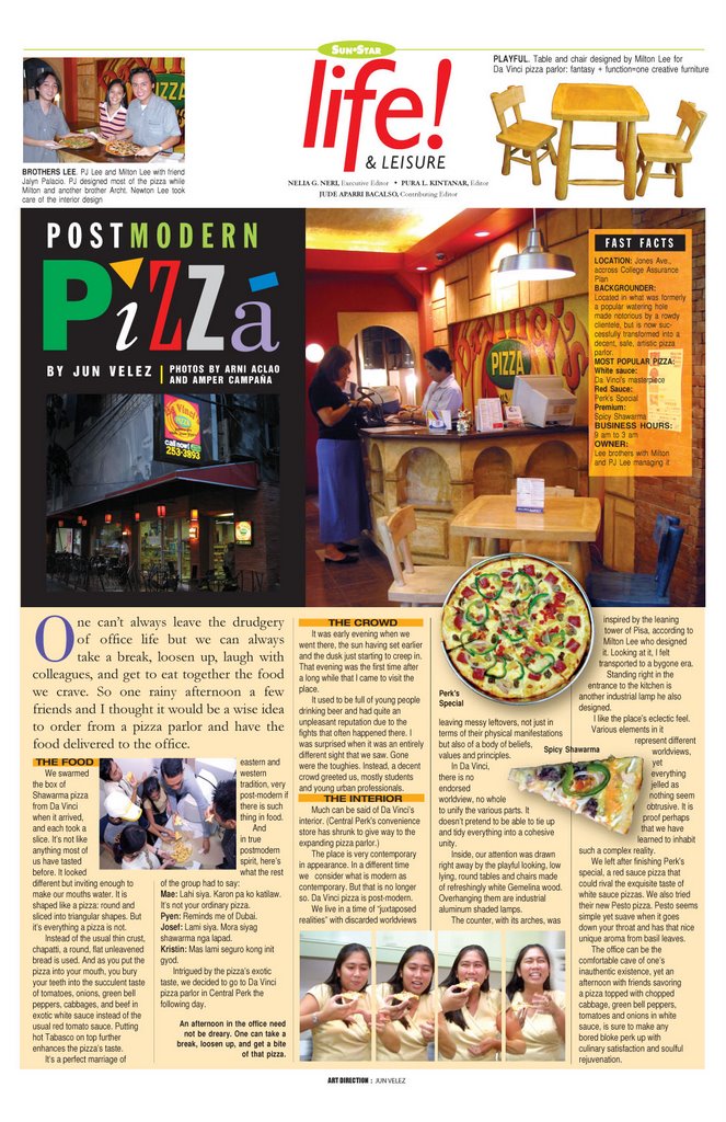
Working in a SunStar publication is like standing on the seashore where shifting sands beneath our feet force us to keep our balance. Nothing stays the same year after year. There are always new ways of producing the paper using the latest prepress hardware and applications. As technology keeps changing and developing, the paper’s look also changes, utilizing new design approaches and techniques that were not possible before.
But now is not the time to sound "techie" or futuristic. It’s time for remembering and this sort of makes me feel old. Belonging to a second generation of Sun.Star employees who have been in the company for the past five to ten years, I find this nostalgic trip like taking a sudden vacation.
A look at old issues of SunStar for the past two decades would show that it has gone through countless changes since it first saw print. Ironically, it is the paper’s maiden design that was most significant.
I take my hat off to the paper’s editor Atty. Pachico Seares. The maiden design of SunStar was remarkable. It was a first, and by community journalism standards, years ahead of the competition and probably of any community paper in the country at that time.
I was in high school when SunStar’s first issue came out. I remember there was a big fuss in our neighborhood in Minglanilla. The canto estambays, the resident sarisari store political observers and commentators were one in admiring the new paper, and talking about this guy Seares who bolted The Freeman to start a newspaper that promises to be different. Indeed, in its professional treatment of stories, sensible commentaries, sensational photojournalism and clean modern layout, the paper really stood out.
The maiden design was modern in the academic sense of the word. The choice of fonts was minimalist. The serif type Times Roman was predominantly used in the news pages. The sans serif type Helvetica or its variation gave the Life and Leisure pages a more relax look in contrast to the serious classic serifs of the news pages. The sports section also looked light with a sans serif type for its headlines.
The design was successful in simplifying to its most basic form the various elements that make up the paper. Unlike its contemporaries and predecessors, SunStar’s design had a central idea, a common thread that tied the different elements together.
The design’s only flaw was that it looked like a broadsheet, betraying the reality of its tabloid size. This is apparent in the miniaturization of the paper’s photographs, headlines, artworks, graphics, etc. (But it may had also been dictated by space constraints as the young paper tried to survive during its early years of operation.) There was also too much detail in the SunStar logo symbol found in the masthead. That probably explains the change years later.
The printing was noteworthy. The use of sheet fed offset printing machines and electronic typewriters spelled the difference. The lines, types, fills and images were clean. Halftones and solid blacks were used to maximum advantage. The paper’s design pushed the monochromatic characteristic of the paper beyond the functional and into the aesthetic.
Advertising’s exploitation of the new print medium was also remarkable. Ads made full use of duotone. The paper’s not being in full color was never a handicap for good designs. Red made wonders when paired with black. There were the full-page Penshoppe advertisements that made use of full-bleed black and white photographs. In a way, SunStar helped the growth of local advertising agencies. It created a demand for ad agency-designed advertisements.
Subsequent redesign saw the paper sporting an all black look in the front page. This was in 1988. It was the first major overhaul of the paper’s design since 1982. Trends in newspaper design, the use of web offset machines for printing and the new desktop publishing technology (with the introduction of the computer), ushered in a new era of newspaper production for Sun.Star. While work was faster, production quality however, wasn’t as good as the shift to non-postscript laser printouts and web offset printing resulted in lower resolution and increased dot gain. It would take a while before the paper’s production would use to full advantage the new technology.
After 13 years SunStar finally shifted to full color printing in 1995. For the first time it had a full color masthead. From duotone (1982) to monochromatic (1988), it finally went full color. But not quite, the 1995 redesign was a transition stage for full color photography and printing. Colored pages this time, carried both CMYK and grayscale images. The 1995 redesign also signaled the shift from a modern, monotonous pattern to an eclectic and playful design.
In 1997, Cebu’s print media landscape was radically changed with the entry of new players in the newspaper business. With this development and the shift to electronic prepress production, SunStar engaged in a major facelift. Further advancement in technology like the use of an imagesetter, and a new web offset machine allowed for major design and publishing innovations never possible before.
With the active involvement of its president, Atty. Jesus Garcia, Jr. and editor-in-chief Pachico Seares together with the publication’s newly formed art department, SunStar underwent a major design overhaul. A product of a two-month study, the design changed the paper’s look overnight. Unlike the previous redesigns, this one didn’t come in installments. It was the first time the paper was redesigned from cover to cover including entire sections. It eventually won for SunStar the Konrad Adenauer 1997 Community Press Award for the Best in Newspaper Design.
For years, SunStar’s design was confined within this premise: tabloid in size but broadsheet in look and content. Even the one that won for SunStar Best in Newspaper Design would be perfect if SunStar goes broadsheet. Realizing the inherent contradictions of looking like the broadsheets, the Art Department in 2000 proposed to the publisher and editor a new design principle that became the basis for SunStar’s present look, three years after the successful 1997 redesign.
In the same manner that modernist painters abandoned realism and celebrated the two dimensionality of the canvass, we acknowledged the limitations of our being a tabloid-sized paper. We accepted and transcended it. The paper’s design is primarily a function of its form or size.
A challenge to the graphic designers was how to maintain the paper’s seriousness and journalistic integrity while employing a more appropriate design. It was clear to everyone, simply because the paper’s size is tabloid (11x17), doesn’t mean it has to be a sensational, rumor mongering, making-a-mountain-out-of–a-molehill type of newspaper.
What we wanted was to overcome the paper’s smallness. We wanted the readers to forget it is such a small paper they’re holding. While mimicking the broadsheets make the paper look smaller, enlarging everything in it, minimizing the number of stories and expanding horizontally - that is, adding more pages - give the paper a semblance of hugeness.
The past three years saw us giving flesh to this design concept. And with the publisher and editor’s support, we have been successful in giving the paper a more contemporary and "politically correct" look. More importantly, we succeeded in preserving the paper’s respectability while packaging it as a tabloid-sized newspaper that is never tabloidish meaning, sensational, hyperbolic, exaggerating.
The changes had not been easy. Every new idea necessitated a change in thinking and ways of doing things. The newspaper business just like almost every facet of human activity had been radically transformed by the IT revolution. The company, and the art department in particular, had to downsize as technology made possible the employment of a leaner, multi-tasking organization helped further by an automated workflow.
Today, editors lay out their own news sections and pages based on a template designed by SunStar’s artists. Feature pages however, remain with artists as these require page designing. Editors now have a more direct hand in determining the paper’s final look, instead of merely sketching dummies that only double the time producing the paper.
For us artists, this is liberating for it means more time for creative activity having been freed from the routinely production nature of our work. What awaits us are a myriad of possibilities when art and technology meet. The computer is but another tool and medium that could unleash one’s reservoir of creativity.
Oftentimes, we wonder what’s the shape of things to come. As long as we welcome change like a surfer riding the waves, the future need not be a source of uneasiness or insecurity. I guess, we just have to get used to the feeling of not standing on solid ground like being on the seashore where shifting sands beneath our feet force us to keep our balance, always.

 Another David Carson-inspired design. This time subject of article is pollution in Naga town.


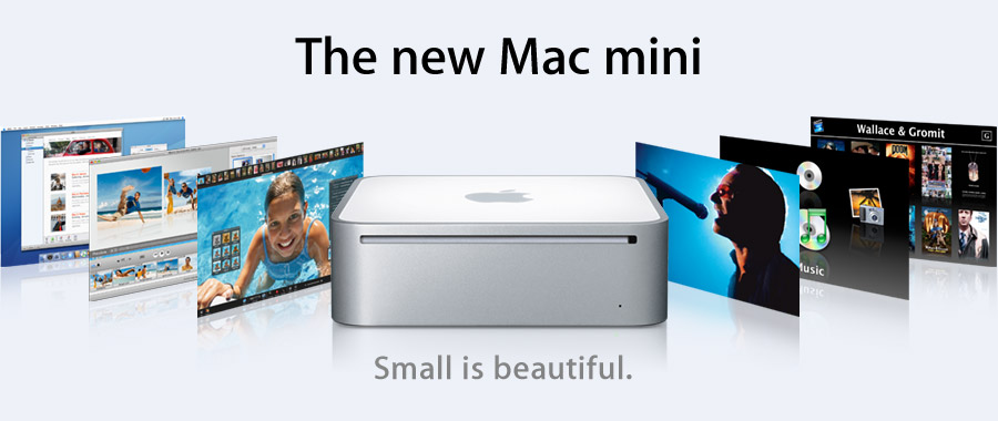 The Mac has landed.
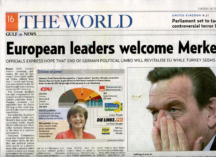
 As a backgrounder, Gulf News is designed by no less than Mario Garcia, so called icon of newspaper design. He did the redesigns for the Wall Street Journal. (I was in the old domestic airport in Manila waiting for my Cebu Pacific flight years ago when I saw it and was really amazed how he was able to preserve the paper’s traditional look while at the same time giving it a 90s touch.)


